Alerts
It is important to reference the bootstrap documentation for how alerts work. This is how to include alerts in your code
Examples
Add any one of the the following in your code, to show an alert
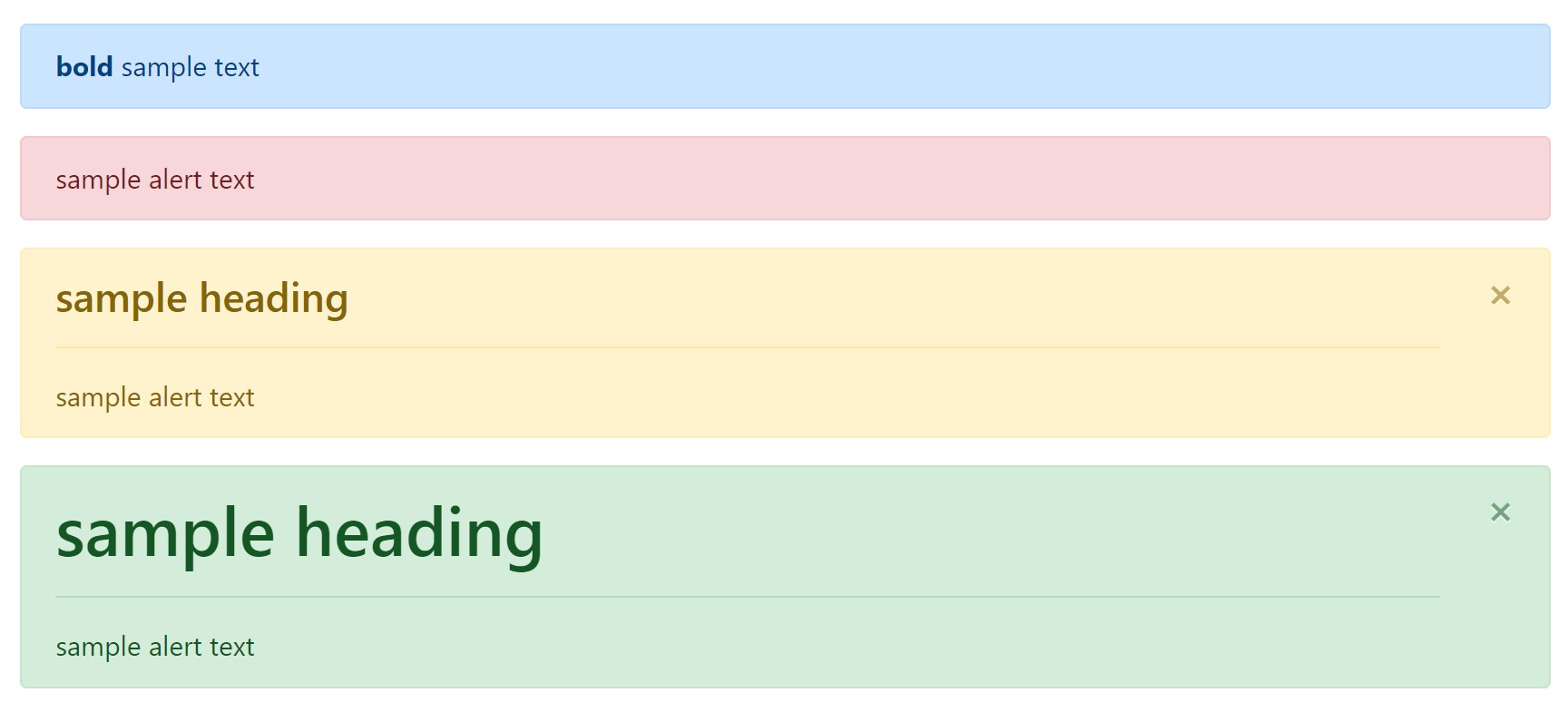
    {% include 'bootstrap_components/alert.html' with content='<strong> bold </strong> sample text' color='primary' %}
    {% include 'bootstrap_components/alert.html' with content='sample alert text' color='danger' %}
    {% include 'bootstrap_components/alert.html' with heading='sample heading' content='sample alert text' color='warning' dismiss=1%}
    {% include 'bootstrap_components/alert.html' with heading='sample heading' heading_size=1 content='sample alert text' color='success' dismiss=1%}
Which look like this:
 demo
demo
Arguments
- Required: content
- the content of the alert. Keep in mind that this string can be html for additional formatting
- string
- Required: color
- accepts bootstrap colors like: primary, success, danger, etc.
- string
- heading
- creates a
<h4>heading by default in the alert - string
- creates a
- heading_size
- overrides
<h4>default, allows 1-6 - int
- overrides
- dismiss
- allows alert to be dismissible, requires bootstrap js
- bool (Enter ‘True’ or 1)