Badges
It is important to reference the bootstrap documentation for how alerts work. This is how to include badges in your code
Examples
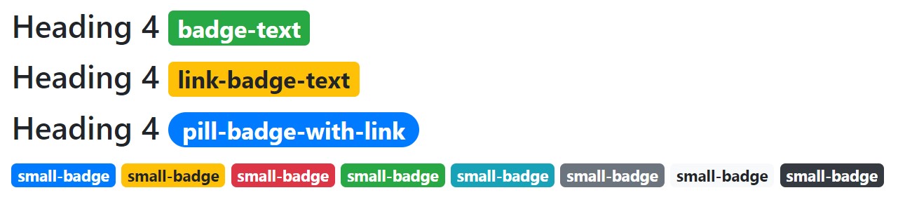
Add any one of the the following in your code, to show an alert
<h4>Heading 4 {% include 'bootstrap_components/badge.html' with content="badge-text" color='success'%} </h4>
<h4>Heading 4 {% include 'bootstrap_components/badge.html' with content="link-badge-text" color='warning' href='www.example.com'%} </h4>
<h4>Heading 4 {% include 'bootstrap_components/badge.html' with content="pill-badge-with-link" href='www.example.com' pill=True%} </h4>
for reference:
{% include 'bootstrap_components/badge.html' with content="small-badge" %}
{% include 'bootstrap_components/badge.html' with content="small-badge" color='warning'%}
{% include 'bootstrap_components/badge.html' with content="small-badge" color='danger' %}
{% include 'bootstrap_components/badge.html' with content="small-badge" color='success'  %}
{% include 'bootstrap_components/badge.html' with content="small-badge" color='info' %}
{% include 'bootstrap_components/badge.html' with content="small-badge" color='secondary' %}
{% include 'bootstrap_components/badge.html' with content="small-badge" color='light' %}
{% include 'bootstrap_components/badge.html' with content="small-badge" color='dark' %}
Which look like this:
 demo
demo
Arguments
- Required: content
- adds text in the middle of the badge
- string
- color
- default: ‘primary’
- accepts bootstrap colors like: primary, success, danger, etc.
- string
- pill
- accepts ‘True’ or 1; allows for more rounded borders
- bool
- href
- allows the badge to be a link, enable hover and actionable properties
- accepts href property
- string