Cards
It is important to reference the bootstrap documentation for how alerts work. This is how to include cards in your code
Alert: This component may require you to send data to the template from context
Description
Cards in bootstrap are highly customizable and very extensible. Thus, we do not support all the different variations of a card, rather a ‘one-size-fits-all’ template. If this is not what works for you we recommend manually adding cards.
The included elements in the card are, in order from top to bottom: an image, a header with a title and a subtitle, some text, a list-group, a footer with two buttons. Like the following:
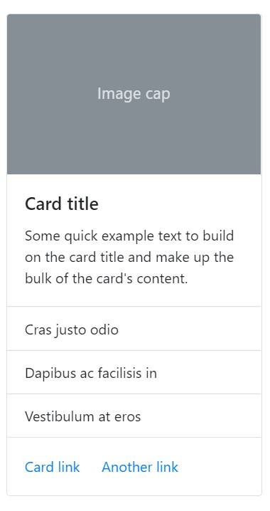 card-explainer
Obviously, you need not enable each element, pick and choose what you want.
Use Case
To understand why we have done things a certain way understanding the expected use case may help. We expect that cards will generally be looped over to show a collection of content like on a storefront displaying its products. Take a look at bootstrap card layout documentation to get a better idea on how to display your cards.
Examples
Add any one of the the following in your code, to show an alert
{% include 'bootstrap_components/card.html' with title='sample card title' subtitle='smaller text here' text='short description of what this is about' size_utilities="w-25" button1_text='click here' button2_text='no click here!' %}
Which look like this:
 cards-demo
Arguments
- image_src
- Accepts a string of the image url, if you want to add a static image use a context manager in your template to do so. i.e.
{% with static '//img.png' as img %} {% include 'bootstrap_components/card.html' image_src=img %}
- Accepts a string of the image url, if you want to add a static image use a context manager in your template to do so. i.e.
- title
- Required
- Accepts a string (can use html like
<strong>) - string
- subtitle
- Accepts a string (can use html like
<strong>) - string
- Accepts a string (can use html like
- text
- Short text that appears after the title
- string
- list_group
- accepts a list of objects from the view
- Requires the following fields: list_group_display_field
- list or iterable like QuerySet
- list_group_display_field
- the field of the object that is iterated on passed in list_group
- string
- button1_text
- text for the first button in the footer
- string
- button2_text
- text for the second button in the footer
- string
- button1_url
- link for the first button, use of reverse recommended if linking to page on site
- string
- button2_url
- link for the second button, use of reverse recommended if linking to page on site
- string
- background
- accepts colors like primary, secondary, success, transparent, etc.
- string
- border
- accepts colors like primary, secondary, success, transparent, etc.
- string
- color
- accepts colors like primary, secondary, success, transparent, etc.
- string
- size_utilities
- use w-50, or h-100, or other utilities for sizing
- string